A good bit of ongoing kvetching between left and right involves the relative importance of preventing spread of the coronavirus vs. preventing the complete collapse of the planetary economy in the wake of a months-long whole-hog shutdown of human activity. To the left, the idea that we should be willing to sacrifice some number of lives to prevent going into a Great Depression is typical heartless capitalist “grind the poor into sausage” awfulness. To the right, the cowardice and mind-destroying blandness of staying locked inside while the world falls apart is untenable; our ancestors charged machine gun nests to free the world from tyranny, but I’m going to huddle in my bedroom because I might catch the flu? Bah.
As usual, these arguments are largely emotional and therefore mostly bullshit. But fortunately, it might be possible to inject some numbers into the debate. Specifically, we can ask how massive pandemic plagues and depressions affect the overall death rate in societies they afflict. Presumably, there is some equilibrium point where deaths caused by the one equal deaths caused by the other; at that point of economic horror, it makes more sense to throw your society into the jaws of the virus and hope for the best, rather than waiting to starve to death or get blown up in a resource war or something.
As is usual, ASD isn’t going to try to do some deep-level analysis of this problem, I’m just going to hoover up data from easy-to-find websites to get a first-run idea of how the numbers look. (As I’ve said before, this is so easy to do, it’s a shame that everyone doesn’t do it before puking up an opinion on Twitter…) In this case, I’m just going to use numbers from the US Census, which will let us understand how the US population has changed over the past 230 years. The first US census was performed in 1790, and is mandated by the US Constitution to occur every 10 years. There’s one going on right now, in fact. So here is the data, obtained from https://www.thoughtco.com/us-population-through-history-1435268:
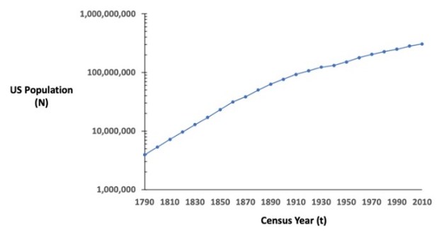
I will point out three things about this graph. First, I’m assigning variable names to the Census year (t, for time) and to the total US Population (N). Second, I’ve plotted the data with the y-axis on a logarithmic scale. That’s because populations usually expand exponentially, which means the numbers form a straight line on a semi-log graph, but a hyperbolic curve when the y-axis is in regular numbers. This makes it a lot easier to understand growth trends — it’s how you ought to be looking at the COVID-19 numbers on that website everybody is refreshing every 30 minutes, for instance, as it demystifies why every day the number of new cases goes up. It’s not because “it’s getting worse out there”, that’s just how living things increase.
The third point is that the growth rate — that is, the slope of log N vs. t — is pretty constant for the first century of the Census, but decreases consistently throughout the 20th and 21st centuries. That’s a general trend throughout the Western world; as material prosperity has increased, the rate of population expansion has gone down. For the most part, this has been driven by a decrease in the birth rate — modern women tend to have fewer babies, and to have them later, than did their colonial counterparts.
But the growth rate isn’t only controlled by the birth rate — it’s also controlled by the death rate. In general, death rates have decreased over time as well, but if we assume that trends in family creation are relatively consistent over time (maybe not the best assumption but it’s the one I’m making), then it’s likely that we can spot periods of increased death as anomalies in the growth rate during certain periods. To see that, let’s plot the first derivative of the census data:

In this graph, each data point represents the exponential growth rate over the decade ending in a given year. For example, the 1810 data point is about 0.03, which means that the population grew by about 3% per year between 1800 and 1810. As was sort of clear from the first graph, you can see there’s a general downward trend in growth rate throughout the history of the US. But now a few data points stand out as lying outside of the trend — all of them on the downward side, possibly representing anomalously increased death rates. The two biggest downward deviations are 1860-1870, representing the enormously bloody US Civil War, where a sizable percentage of marrying-age men died or were permanently fucked up from warfare, and 1930-1940, corresponding to the Great Depression. I’ve also highlighted two other relevant decades, 1910-1920, encompassing both World War I and the infamous 1918 Spanish flu pandemic, and 1940-1950, covering World War II and the biggest years of the “Baby Boom” generation. Strikingly, the Spanish flu barely made a dent in the overall growth rate trend of the US population during its generation, even when casualties from World War I were added. World War II, the bloodiest war in human history, actually resulted in an increase in US growth rate during its decade. In comparison, the Great Depression looks like an enormous outlier.
We can see this effect even more clearly by taking the second derivative of the data — that is, the rate of change of the growth rate from one decade to the next:
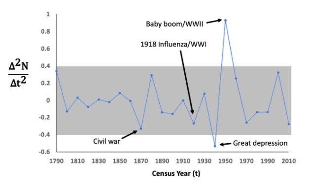
Here we can see that there have been about as many decades where the growth rate has gone up compared to the previous decade as decades where the opposite trend occurred. The gray box represents one standard deviation of the mean above and below the mean growth rate change of -2% per decade. There are only two data points that lie outside of this confidence interval — the Depression and the subsequent Baby Boom. Not even the Civil War, and definitely not the Spanish Flu, can compete with the killing power of a major economic disturbance.
It’s possible that the huge change in growth rate caused by the Depression involved lower birth rates in addition to death rates, but in a world prior to the invention of reliable birth control, my money is on the Reaper controlling that data point. I honestly don’t know what lesson this leaves us with regarding our current troubles, but it’s worth considering that a few million deaths concentrated into a single year, as jarring and horrifying as the concept is, can’t compare to the sustained nightmare of economic depression in terms of total numbers of bodies accrued. Surely there is some strategy available to our country that balances death rate with economic stability. But one despairs of politicians finding it, especially in an election year.

