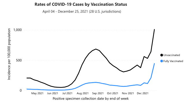
A few days ago Steve Sailer posted some recent graphs of US COVID cases (and deaths) in unvaxxed vs. vaxxed vs. boosted individuals that I found first surprising, then completely implausible. The graphs come from this CDC website – I’m not sure how long it has been up, but the “publications” cited in the fine-print footnotes are, at the earliest, from September last, and this is the first time I’m seeing some of these numbers, so I’m guessing it is a reasonably recent tool. Regardless, here’s the graph that Steve posted:

Which certainly gives the impression that the vaccine (and its booster) not only provides powerful protection against infection, but that the degree of protection has remained consistent for months. I found this completely unbelievable, because if nothing else the steady rate of infection of the unvaxxed should cause them to become less and less susceptible over time — a recovered individual is at least as resistant as a vaxxed one — so it’s prima facie implausible that the level of relative protection wouldn’t decrease. For comparison, here is a graph from the same website that shows broader context, including the period prior to “boosting”:
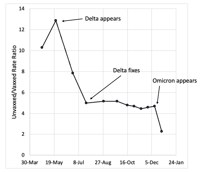
Which shows a bit more fluctuation in vaccine efficacy, but still lends the impression that it remains highly effective. But my bullshit detector goes off whenever I see anything from the CDC at this point, so I decided to look a little closer — it’s easy to mislead with graphs. While I wasn’t able to download the raw data directly (not willing to go plowing through subpages to find a link), I was able to extract enough info from the graphic charts to make this rough plot which I think is more informative:
Clearly the efficacy of the vaccines is waning over time. The suddenness of the shifts – from roughly 10x protection in this data set, down to 4-5x, down to 2x and dropping, is consistent not with the waning of vax-induced antibodies, but (as I have argued before on this blog) with the documented selective sweeps of vaccine-resistant viral genotypes Delta and Omicron occurring in summer and winter 2021 respectively. In other words, it is unreasonable to think a booster shot of the same vaccine could provide any benefit – at least not an immunological benefit, although it’s possible I suppose that inducing a chronic state of inflammation or high-level immune preparedness could reduce symptoms somehow, probably with a trade-off in terms of increased risks on other fronts, like heart disease (short term, and already observed, at least anecdotally, by many of us) and cancer (longer term, especially for anyone foolish enough to keep this jab insanity going for years). Based on the trend in the graph, I would anticipate that the next variant would render the vaccine completely obsolete, even based on this CDC data.
Something similar is observed with the CDC’s data on death rates. Here’s their graph (again, from Steve’s blog):

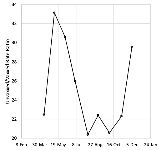
And here is my re-creation, showing ratios of unvaxxed:vaxxed rates (focusing only on the 65-79 age group, since it is the only age group likely to represent actual COVID deaths in great enough numbers to be meaningful):
So not much evidence of the same trend. In fact, no real trend at all, other than that the vaccine provides strong protection against the worst outcomes. Hmm.
I don’t intend this to be just a “analyze the vaxx data” post. What I’m interested in, is why my first thought when I saw the data was to be suspicious of it. Am I paranoid? Have I gone full anti-vaxxer, to the point that I instantly start looking for reasons to refute pro-vax information? I don’t feel anti-vaccine; I would still encourage people to get tetanus shots, for instance, and am tentatively still supportive of childhood vaccination (although I have learned there is a lot about that practice that I have taken for granted which is apparently not entirely true). I’m certainly not “anti-science”, as is hopefully obvious based on my career choice. Maybe, then, there’s something else afoot that prompts me to sneer at the CDC’s graphs and probe their data when most of my colleagues just shrug their shoulders and move on? Let’s look closer and find out.
What we are dealing with here is an issue of Bayesian inference. In simple terms (and I don’t want to suggest I could explain it in more complicated ones), Bayes’ theorem describes the conditions which should cause a reasonable person to change their mind about something. Briefly, the more confident you are of a pre-existing (or prior) belief, and the less confident you are in the trustworthiness of a new piece of evidence, the more hesitant you should be to update your original belief. When you hear somebody say something about “updating their priors”, that’s what they’re talking about. It’s also how two people can look at the same exact evidence, and one of them be convinced while the other remains skeptical — it’s about the strength of their priors and their evaluation of the evidence’s plausibility.
Suffice it to say, my priors after two years of pandemic porn are “The CDC manipulates data to fool people into doing what the regime wants them to do” and “The CDC are politicians, not scientists” and “Politicians don’t give a single shit about the truth”. So a graph, on its own, is highly unlikely to change my mind in my conviction that the COVID vaccines are garbage. But let’s dissect all those priors, and how they pertain to this particular dataset, to see if I am being unfairly picky.
What initially surprised me about the graphs Steve posted was that the CDC data showed any effect of the vaccine at this point, because the UK and Israeli data have been pretty unequivocal in their conclusion that “double-vaxxed” is “unvaxxed”, i.e., the vaccine provides no protection — at best. The CDC webpage is pretty short on methods, but they do claim that the data are unadjusted, just like the UK data which show unvaxxed having half the rate (or less) of testing positive as vaxxed. The data appear to be collected directly from state health departments in about half of the states in the US, so it’s probably a fairly representative sample. My priors tell me that it’s unlikely that the US numbers are any different than the UK’s and Israel’s; but our political situation is quite different, so it’s highly likely that the CDC is fudging something to make their numbers look better. Is this plausible?
I can imagine three problems that could lead to the differences between the US rate estimates and the UK/Israeli data. All three are easily foreseeable by careful scientists; two of them are understandable but should at least be acknowledged in the report, but the third ought to be grounds for being drawn and quartered. So let’s look at them. First, there could be differences in testing regimes in the three countries. Ever since the beginning of the pandemic it’s been clear that randomized testing of the entire population reveals many cases that would be invisible if we only tested people with symptoms. In many parts of the US, people without vax papers are required to test regularly to participate in normal life. Therefore, it is much more likely that mild infections will be detected in the unvaxxed than the vaxxed, artificially inflating the numerator of the rate estimate (thus making it go up). This is probably less of an issue in the UK and Israel, where the unvaxxed have just been excluded, period, from everything for several months, so no need to test them any more than anyone else*.
Second, it’s possible that there is a problem with the denominator of the rate estimate – the relative population sizes of vaxxed vs. unvaxxed. According to the CDC site, in order to be considered vaccinated, a person had to have a record in their name of receiving both vaccine doses, and the size of the total population was estimated from the US Census data. Both of these could be grievously wrong because of the massive size of the “undocumented” population in the US. By some estimate there could be 30 million illegal aliens inside the US borders right now – roughly 10% of the total population of the country. There are also massive populations of “homeless” and other distressed individuals whose papers are likely not in very good order. These individuals are almost uniformly poor and urban and therefore vastly more likely to contract any communicable disease, by definition. One, when they get tested, they’ll be marked “unvaxxed” whether they are or not (presumably we’re trying to vaccinate these people with or without ID, right?), because there will be no record of their existence in any database, which would artificially increase the unvaxxed rate (and decrease the vaxxed rate). Two, the total population estimate is likely too low, potentially by quite a lot, which would artificially decrease the unvaxxed rate. So the vaxxed rate is probably a pretty good estimate, but the unvaxxed rate is a total crapshoot. There’s also this weird caveat in the CDC’s fine print (emphasis mine):
A continuity correction has been applied to the denominators by capping the percent population coverage at 95%. To do this, we assumed that at least 5% of each age group would always be unvaccinated in each jurisdiction. Adding this correction ensures that there is always a reasonable denominator for the unvaccinated population that would prevent incidence and death rates from growing unrealistically large due to potential overestimates of vaccination coverage.
This suggests that enough regions are reporting > 100% vaccination rates that the data has to be scaled somehow to fix this unrealistic number. It’s harder to explain how the estimates of vaccine coverage could be wrong than how the unvaccinated number could be messed up – it seems, well, sloppy. Which could be said of a lot of government activity in the US, which should lend a good bit of skepticism to any consideration of these data.
Both of the above methodological caveats are understandable, except for the fact that the people reporting these things are supposed to be epidemiological experts who ought to know how to do this sort of data collection and number crunching in a straightforward and honest way. But a third possibility is that the reporting agencies are just lying. On one level this possibility seems remote because so many entities are involved in the testing and reporting apparatus. On the other hand, you have to remember that the public doesn’t have access to any of that raw data, only the aggregates that are posted online, usually by government agencies like CDC. So if CDC’s policy was to “curate” or otherwise alter the data before releasing it, there would be no way for most people to know – including any of the individual reporting entities, none of whom know much about the numbers being reported by other entities. So it comes down to, how much do you trust these ultimate reporting agencies to be honest? Given the state of things in the West, the reasonable position is, basically not at all; if CDC, a political organization, could benefit the regime by falsifying data, and they thought they could get away with it, they would 100% lie.
So is it reasonable that I find the CDC’s data sketchy, or am I a paranoid anti-vaxxer? Bayes’ theorem tells us that it might very well be the case that the CDC’s numbers are accurate, and nevertheless that one would still be justified in evincing skepticism. If my prior expectation is that an information source is compromised or untrustworthy, then the bar goes up for how iron-clad the data has to look before I trust it. If you trust the US government then i) what the fuck is wrong with you, and ii) you are much more likely to trust the CDC’s reports as presented than I am. If on the other hand you’ve noticed that they lie about all sorts of shit all the time, and that every agency of the government appears to be compromised to some degree by boot-licking wokery, then you are far less likely to believe that any government agency could be expected to conduct objective science without undue political influence and bias. If you acknowledge that it is reasonable to mistrust government data drops, then you acknowledge that my skepticism (and that of the many people who are thinking about this the way I am) deserves to be treated with some respect.
In the next post I’ll probe a little deeper into some of this data and try to find a way to “ground-truth” the data. I’ll also consider some other reasons my priors are weighted against the CDC’s report — scientific reasons, not political ones.
* Update — I overstated the degree to which the unvaxxed have been excluded from UK society, and indeed it looks like they do have a problem of over-testing the unvaxxed. Which would mean that the evidence of vaxx failure shown in the UKHSA data is actually underestimated — creating an even bigger discrepancy between the CDC’s numbers and the UK’s.


Hello, big fan of your blog! Just wanted to point out, with regards to one sentence “This is probably less of an issue in the UK and Israel, where the unvaxxed have just been excluded, period, from everything for several months, so no need to test them any more than anyone else.” – I’m British, and we (the unvaxxed) haven’t been excluded from much. There was a point where you needed either double vaccination or a test (all tests were always free) to attend large (10,000 people or more) events like football matches or concerts. In the devolved nations (Wales, Scotland and Northern Ireland.. our ‘blue states’) they have/had worse rules, as they always compete with England to be seen as ‘kinder’. But I think even there, tests were always accepted.
Thanks for the correction! I’m going to update the post accordingly. It’s worth noting though, that if unvaxxed need to test to get admitted into places, but vaxxed don’t, that should greatly increase the estimate of the unvaxxed infection rate. Which would make the UKHSA numbers eugyppius has been posting a lowball estimate of vaxx failure…