I’m guessing President Brandon is going to keep Ukraine and Russia in the news again this week. I’m not going to write any more about it — I really don’t care if Russia invades Ukraine or not as long as the US stays out of it — but what I absolutely WILL do is post some of my favorite Ukrainian and Russian metal bands for your listening pleasure!
My policy from here on out, just so y’all know, is that you don’t get to have an opinion about Ukraine if you can’t name even one Ukrainian band. So get with the program, chickenhawks! I expect to see Max Boot in a Nokturnal Mortem tee in his next CNN vomit session…
Anyway, without question, the greatest Ukrainian band ever is the aforementioned Nokturnal Mortum. Here’s their 2009 album The Voice of Steel in full — in my opinion, it remains their best work, and a true black metal classic:
Another excellent Ukrainian black metal band is Drudkh. Trying to pick a single track to post is impossible — they have at least a half-dozen great albums — so I’ll just go with my gut and introduce you to the 2006 record Blood In Our Wells:
Both NM and Drudkh use Ukrainian and Slavic folklore and pagan ideas as the central themes for their music. If there is such a thing as Ukrainian nationalism, they certainly embody it. I tried to find an interview somewhere where they opined on Russia, but couldn’t find much.
But let’s not leave Russia out! Just like with Ukraine, I have no difficulty deciding who my favorite Russian band is — Arkona. I saw these guys in Atlanta a few years ago and the singer, Masha, absolutely blew me away. Here is an Arkona classic that I would probably get stuck in my head more often if I understood any of the lyrics:
Here is an English translation of the lyrics (from this site, which also includes commentary on the religious meaning of some of the references):
Mother Earth is great, Rus the Great! Oh, how wide are your lands, Through the golden fields Dazhdbog’s children came there.
Through the old eternal thickets, Through the distant lands, Our native brothers began their way – They are Dazhdbog’s sons. Raising our menacing flags up, We’ll revive the Rus of bygone times! We’ll keep the testament of Prav, I swear to the Gods!
Oh, Mother-night, daughter of Svarog, I beg you to hide the ancient behests of ancestors, I beg you to hide them from an evil eye of enemy In the thickets of holy forests.
My heart was dying down When I said words hardly breathing: “A glory to you, my dear mother! A glory to you, Russian soul! Through the old eternal thickets, Through the distant lands, Dear brother, let us say: “A glory to you, Rus, my Land!”
It’s immediately obvious that, like NM and Drudkh, Arkona uses Slavic pagan folklore as the basis for their music, and all three are deeply inspired by their nation’s history and culture. I have to admit that I don’t know a whole lot about the Slavic pagan tradition, but I would be very interested to know how much overlap there is between how the Russians and the Ukrainians view their pre-Christian traditions. If I’m not mistaken, the first Rus kingdoms were formed in what is today Ukraine, by Viking adventurers. So perhaps it’s more accurate to say that Russia is an extension of Ukraine than vice versa? Who knows, but I would have to hazard a guess that Slavs who look to their ancient past for inspiration probably don’t think much of the modern political borders of the post-USSR world, any more than Western heathens care much for the current political regimes of North America and Western Europe. Regardless, the music is awesome, long live Slavic pagan black metal!
In the first part of this post I re-examined some misleadingly presented data from the US CDC, and then spent a good bit of energy exploring why my immediate instinct was to mistrust the CDC’s reporting. Basically, my “Bayesian priors” about the CDC’s trustworthiness are low, because it’s a government agency and the government lies continually about anything that has a political impact — which is to say in the Age of Wokeness, everything. But this isn’t an acceptable end point — because the data in question is actually pretty important, and we need to be able to arrive at some kind of confidence about our interpretation of it. Does the vaccine work or not? If you are a vaccinated person in a vulnerable group, should you be worried, or should you feel confident going about your life like normal? We can’t stop the CDC from being an unreliable reporter; and we can’t expect any non-state organization to be able to provide this kind of aggregate epidemiological data in a real-time manner; so how can we recognize good science through the noise of political bullshittery? Sometimes (at least theoretically) the CDC publishes data that is both true and not misleading — I know some of these guys and can vouch for their not being completely dishonest or incompetent — so how can we spot the real science in the sea of garbage?
One way to approach this problem is to compare reports from different agencies that are not (at least directly) connected to each other. This of course was where my skepticism about the particular dataset mentioned in my last post started – by comparing it to data from the UK and Israel. One reason I have tended to trust the UK data is that they have been posted consistently on a week-by-week basis since the beginning of the “pandemic”. Because of this, the effect of a sudden politically-driven course correction is much more likely to be visible, reducing the chance that the agencies might think they could get away with fudging or burying inconvenient numbers. But you perhaps can’t use the UK data as a direct comparison with US data, because one could claim that the populations are sufficiently different that you can’t assume the two should look the same. Perhaps, though, we can find some subset of the US data that is trustworthy in the same way that the UK data is, which would make for a good sanity check of the CDC’s numbers.
Some friends and I have followed the COVID reports from Vermont fairly closely since last fall, because they were one of the only states to report reasonably transparent data about “breakthrough” infections. They did this long before you could similar data for the whole country from the CDC, for instance. Because of this reporting schedule, and because Vermont is relatively small and relatively well-off, it avoids some of the potential problems we noted with the US data as a whole. For example, there aren’t many illegal aliens in Vermont — at 0.1% of the total population, it’s in fact the lowest illegal population of all 50 states. Similarly, only North Dakota and Wyoming have lower per capita homelessness rates than Vermont. So we can be much more confident that the denominator of the vaxxed/unvaxxed ratio is well-constrained for this dataset. Let’s see how Vermont’s numbers compare to the country as a whole.
Based on this early February report (and my calculations from it), there were about 18,000 infections in unvaccinated Vermonters in January, and 22,000 infections in vaccinated individuals. So right there is data surprising to a lot of normies: the absolute number of infections is greater in the vaxxed population. When you compare these numbers to the overall census Vermont population of 643,503, 80% of which is vaccinated, you get a 4.2% risk of infection for vaxxed, and a 14.1% risk of infection for unvaxxed, or about a 3.3x lower risk for vaxxed. First of all, stop and consider the fact that more than 6% of the population of the state caught COVID in one month, despite the fact that 80% of its people were “fully vaxxed”. Not exactly glowing support for the vaccine. But my calculation of the efficacy of the vaccine in Vermont is actually slightly better than the estimate from the national data posted by CDC. There might be reasons why it would be elevated — Vermont schools, for instance, require unvaxxed people to test after exposure, but not vaxxed, which probably inflates the unvaxxed rate estimate — but regardless, it’s in the same ballpark, so I think we can safely conclude that the CDC’s data on infection risk reduction from vaccination is roughly accurate.
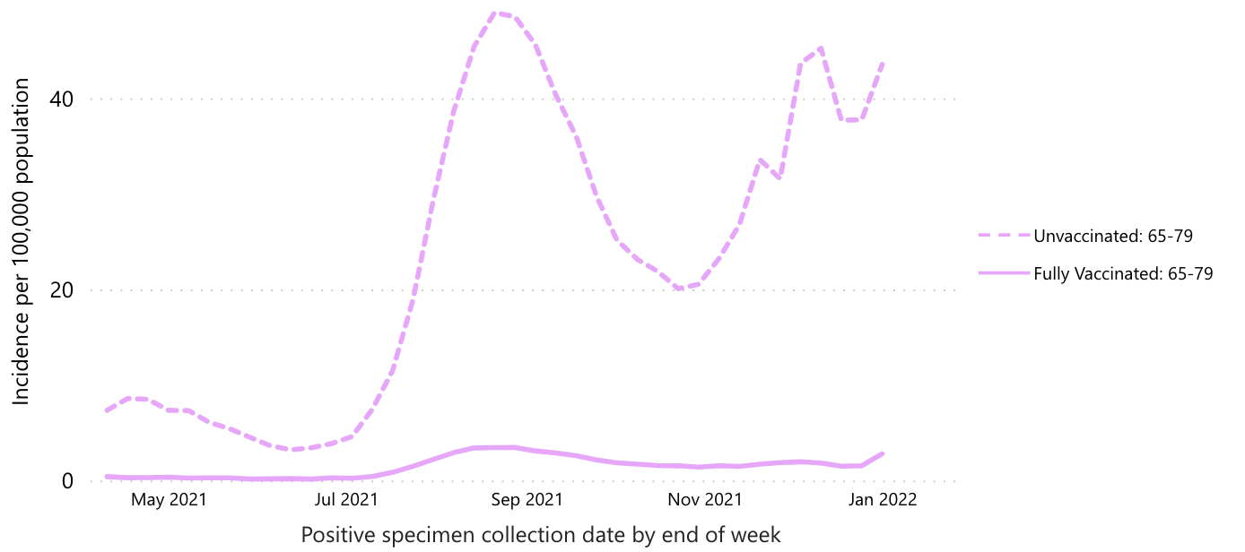
On the other hand, the data on death risk is less convincing. According to the CDC data, the “protection from death” ratio from vaccination is something like 20-30x. The graph below focuses only on the 65-79 year old age group, since that’s the one where the vast majority of COVID-only deaths have occurred:
In Vermont, though, the improvement is roughly the same as the improvement in terms of infection risk. You have to do some crunching to get these numbers as I couldn’t find a place to get the raw numbers, but here’s my thinking. There have been 566 total deaths in Vermont through January 2022, and 65, or 11.5%, of those occurred in January. There have also been 157 deaths in fully vaccinated Vermonters, but I couldn’t find how many of those occurred in January. If we assume that the same overall percentage of them – 11.5% – occurred in January, than that’s 18 vaxxed January deaths, compared to 47 unvaxxed deaths. That’s a ratio of only 2.6, fully an order of magnitude less protection than the CDC (and nearly all other sources, including anti-mandate sources) claims. If we calculate the numbers based on risk of death after infection, 18 of 21,800 vaxxed COVID patients died in January (0.08%), compared to 47 of 18,200 unvaxxed (0.26%), for a factor of 3.1x protection. Again, much less protection than CDC claims. Still probably enough to justify getting vaxxed if you’re miraculously still COVID-naïve and don’t believe the vaxx causes heart attacks, but way less than the regime’s vaxx propaganda claims. I will note that this was exactly what my friends and I observed in the Vermont data back last fall – a much much lower estimate of protection vs. death in Vermont than in the nationwide data.
So who should you trust? We’re back to our Bayesian priors again, aren’t we? My feel is that you should immediately trust the smaller organization more than the larger, because data falsification or bad-actor behavior would be more visible in the small Vermont health care community than in the whole of the US. Vermont is also a very civilized place that is likely to keep fine records and have relatively high amounts of scruples about accuracy, honesty, and so forth, at least compared to the weasels in DC.
But the real reason I trust the Vermont numbers is that they suit my scientific priors, not just my political ones. Briefly, it just doesn’t make any sense for the vaccine to provide superior protection against death than against infection in general. If the vaccine-induced antibodies are capable of identifying and killing COVID-infected cells sufficiently to reduce serious outcomes, why wouldn’t they also be able to do it to mild infections? One would expect them to provide similar reductions in risk for all outcomes of viral infection, not dramatically higher protection against death than sniffles. In Vermont, the vaccine provides similar levels of protection against both infection (i.e. testing positive for COVID) and death, which makes a lot more sense than the completely bizarre observation of 10x greater protection from death than from infection.
For these reasons I’m strongly leaning toward trusting Vermont and accusing CDC of lying. In the absence of a coherent scientific explanation, the best explanation for why vaccine-induced antibodies would protect against death but not sniffles is that voters care about death a lot more than they care about sniffles. Plus it’s a hell of a lot easier to conceal the true death rate than the sniffle rate. Most of us don’t know anybody who has died of COVID, but for the last month we’ve watched tons of people (mostly fully vaccinated) catch it. So CDC presents an honest picture of vax protection against infection, but fudges things somehow (I am not sure how) to reduce the death rate in the vaccinated. But we’ve all seen how the death rate can be manipulated up or down based on what we count as a COVID death — so it’s very easy to imagine this number can be gamed by the aggregators at CDC on command of their political bosses.
The tragedy of all of this is that I even have to ask these sorts of questions. We truly live in an informational void, where you can’t readily trust anything that you don’t see with your own eyes. And the frequency with which some media outlet tells you that what you personally saw happen never happened is disturbingly high. What are the long-term consequences of this disintegration of credibility in our institutions? What does the world look like when you can’t trust your doctors anymore? It’s like some kind of singularity – we are sitting on the event horizon of a world that people born in the United States can barely imagine.
One great thing about taking a Bayesian approach to issues like this is that it gives us a way to understand people we disagree with — you have to address their priors, which may be different from yours for good reason. If their priors are different, and are not completely unreasonable, then it’s fairly easy to “agree to disagree”. It also might tend to steer contentious conversations toward those priors, instead of the proximal issue of disagreement, which might lead to deeper understanding and compassion, and help us as a society step back from the precipice upon which we are teetering. If enough of my scientific colleagues could embrace this worldview and performatively model it for the public, I truly believe it would make a difference. Alas, my priors are strong that this will not happen — but I would love to be proven wrong.
A few days ago Steve Sailer posted some recent graphs of US COVID cases (and deaths) in unvaxxed vs. vaxxed vs. boosted individuals that I found first surprising, then completely implausible. The graphs come from this CDC website – I’m not sure how long it has been up, but the “publications” cited in the fine-print footnotes are, at the earliest, from September last, and this is the first time I’m seeing some of these numbers, so I’m guessing it is a reasonably recent tool. Regardless, here’s the graph that Steve posted:
Which certainly gives the impression that the vaccine (and its booster) not only provides powerful protection against infection, but that the degree of protection has remained consistent for months. I found this completely unbelievable, because if nothing else the steady rate of infection of the unvaxxed should cause them to become less and less susceptible over time — a recovered individual is at least as resistant as a vaxxed one — so it’s prima facie implausible that the level of relative protection wouldn’t decrease. For comparison, here is a graph from the same website that shows broader context, including the period prior to “boosting”:
Which shows a bit more fluctuation in vaccine efficacy, but still lends the impression that it remains highly effective. But my bullshit detector goes off whenever I see anything from the CDC at this point, so I decided to look a little closer — it’s easy to mislead with graphs. While I wasn’t able to download the raw data directly (not willing to go plowing through subpages to find a link), I was able to extract enough info from the graphic charts to make this rough plot which I think is more informative:
Clearly the efficacy of the vaccines is waning over time. The suddenness of the shifts – from roughly 10x protection in this data set, down to 4-5x, down to 2x and dropping, is consistent not with the waning of vax-induced antibodies, but (as I have argued before on this blog) with the documented selective sweeps of vaccine-resistant viral genotypes Delta and Omicron occurring in summer and winter 2021 respectively. In other words, it is unreasonable to think a booster shot of the same vaccine could provide any benefit – at least not an immunological benefit, although it’s possible I suppose that inducing a chronic state of inflammation or high-level immune preparedness could reduce symptoms somehow, probably with a trade-off in terms of increased risks on other fronts, like heart disease (short term, and already observed, at least anecdotally, by many of us) and cancer (longer term, especially for anyone foolish enough to keep this jab insanity going for years). Based on the trend in the graph, I would anticipate that the next variant would render the vaccine completely obsolete, even based on this CDC data.
Something similar is observed with the CDC’s data on death rates. Here’s their graph (again, from Steve’s blog):
And here is my re-creation, showing ratios of unvaxxed:vaxxed rates (focusing only on the 65-79 age group, since it is the only age group likely to represent actual COVID deaths in great enough numbers to be meaningful):
So not much evidence of the same trend. In fact, no real trend at all, other than that the vaccine provides strong protection against the worst outcomes. Hmm.
I don’t intend this to be just a “analyze the vaxx data” post. What I’m interested in, is why my first thought when I saw the data was to be suspicious of it. Am I paranoid? Have I gone full anti-vaxxer, to the point that I instantly start looking for reasons to refute pro-vax information? I don’t feel anti-vaccine; I would still encourage people to get tetanus shots, for instance, and am tentatively still supportive of childhood vaccination (although I have learned there is a lot about that practice that I have taken for granted which is apparently not entirely true). I’m certainly not “anti-science”, as is hopefully obvious based on my career choice. Maybe, then, there’s something else afoot that prompts me to sneer at the CDC’s graphs and probe their data when most of my colleagues just shrug their shoulders and move on? Let’s look closer and find out.
What we are dealing with here is an issue of Bayesian inference. In simple terms (and I don’t want to suggest I could explain it in more complicated ones), Bayes’ theorem describes the conditions which should cause a reasonable person to change their mind about something. Briefly, the more confident you are of a pre-existing (or prior) belief, and the less confident you are in the trustworthiness of a new piece of evidence, the more hesitant you should be to update your original belief. When you hear somebody say something about “updating their priors”, that’s what they’re talking about. It’s also how two people can look at the same exact evidence, and one of them be convinced while the other remains skeptical — it’s about the strength of their priors and their evaluation of the evidence’s plausibility.
Suffice it to say, my priors after two years of pandemic porn are “The CDC manipulates data to fool people into doing what the regime wants them to do” and “The CDC are politicians, not scientists” and “Politicians don’t give a single shit about the truth”. So a graph, on its own, is highly unlikely to change my mind in my conviction that the COVID vaccines are garbage. But let’s dissect all those priors, and how they pertain to this particular dataset, to see if I am being unfairly picky.
What initially surprised me about the graphs Steve posted was that the CDC data showed any effect of the vaccine at this point, because the UK and Israeli data have been pretty unequivocal in their conclusion that “double-vaxxed” is “unvaxxed”, i.e., the vaccine provides no protection — at best. The CDC webpage is pretty short on methods, but they do claim that the data are unadjusted, just like the UK data which show unvaxxed having half the rate (or less) of testing positive as vaxxed. The data appear to be collected directly from state health departments in about half of the states in the US, so it’s probably a fairly representative sample. My priors tell me that it’s unlikely that the US numbers are any different than the UK’s and Israel’s; but our political situation is quite different, so it’s highly likely that the CDC is fudging something to make their numbers look better. Is this plausible?
I can imagine three problems that could lead to the differences between the US rate estimates and the UK/Israeli data. All three are easily foreseeable by careful scientists; two of them are understandable but should at least be acknowledged in the report, but the third ought to be grounds for being drawn and quartered. So let’s look at them. First, there could be differences in testing regimes in the three countries. Ever since the beginning of the pandemic it’s been clear that randomized testing of the entire population reveals many cases that would be invisible if we only tested people with symptoms. In many parts of the US, people without vax papers are required to test regularly to participate in normal life. Therefore, it is much more likely that mild infections will be detected in the unvaxxed than the vaxxed, artificially inflating the numerator of the rate estimate (thus making it go up). This is probably less of an issue in the UK and Israel, where the unvaxxed have just been excluded, period, from everything for several months, so no need to test them any more than anyone else*.
Second, it’s possible that there is a problem with the denominator of the rate estimate – the relative population sizes of vaxxed vs. unvaxxed. According to the CDC site, in order to be considered vaccinated, a person had to have a record in their name of receiving both vaccine doses, and the size of the total population was estimated from the US Census data. Both of these could be grievously wrong because of the massive size of the “undocumented” population in the US. By some estimate there could be 30 million illegal aliens inside the US borders right now – roughly 10% of the total population of the country. There are also massive populations of “homeless” and other distressed individuals whose papers are likely not in very good order. These individuals are almost uniformly poor and urban and therefore vastly more likely to contract any communicable disease, by definition. One, when they get tested, they’ll be marked “unvaxxed” whether they are or not (presumably we’re trying to vaccinate these people with or without ID, right?), because there will be no record of their existence in any database, which would artificially increase the unvaxxed rate (and decrease the vaxxed rate). Two, the total population estimate is likely too low, potentially by quite a lot, which would artificially decrease the unvaxxed rate. So the vaxxed rate is probably a pretty good estimate, but the unvaxxed rate is a total crapshoot. There’s also this weird caveat in the CDC’s fine print (emphasis mine):
A continuity correction has been applied to the denominators by capping the percent population coverage at 95%. To do this, we assumed that at least 5% of each age group would always be unvaccinated in each jurisdiction. Adding this correction ensures that there is always a reasonable denominator for the unvaccinated population that would prevent incidence and death rates from growing unrealistically large due to potential overestimates of vaccination coverage.
This suggests that enough regions are reporting > 100% vaccination rates that the data has to be scaled somehow to fix this unrealistic number. It’s harder to explain how the estimates of vaccine coverage could be wrong than how the unvaccinated number could be messed up – it seems, well, sloppy. Which could be said of a lot of government activity in the US, which should lend a good bit of skepticism to any consideration of these data.
Both of the above methodological caveats are understandable, except for the fact that the people reporting these things are supposed to be epidemiological experts who ought to know how to do this sort of data collection and number crunching in a straightforward and honest way. But a third possibility is that the reporting agencies are just lying. On one level this possibility seems remote because so many entities are involved in the testing and reporting apparatus. On the other hand, you have to remember that the public doesn’t have access to any of that raw data, only the aggregates that are posted online, usually by government agencies like CDC. So if CDC’s policy was to “curate” or otherwise alter the data before releasing it, there would be no way for most people to know – including any of the individual reporting entities, none of whom know much about the numbers being reported by other entities. So it comes down to, how much do you trust these ultimate reporting agencies to be honest? Given the state of things in the West, the reasonable position is, basically not at all; if CDC, a political organization, could benefit the regime by falsifying data, and they thought they could get away with it, they would 100% lie.
So is it reasonable that I find the CDC’s data sketchy, or am I a paranoid anti-vaxxer? Bayes’ theorem tells us that it might very well be the case that the CDC’s numbers are accurate, and nevertheless that one would still be justified in evincing skepticism. If my prior expectation is that an information source is compromised or untrustworthy, then the bar goes up for how iron-clad the data has to look before I trust it. If you trust the US government then i) what the fuck is wrong with you, and ii) you are much more likely to trust the CDC’s reports as presented than I am. If on the other hand you’ve noticed that they lie about all sorts of shit all the time, and that every agency of the government appears to be compromised to some degree by boot-licking wokery, then you are far less likely to believe that any government agency could be expected to conduct objective science without undue political influence and bias. If you acknowledge that it is reasonable to mistrust government data drops, then you acknowledge that my skepticism (and that of the many people who are thinking about this the way I am) deserves to be treated with some respect.
In the next post I’ll probe a little deeper into some of this data and try to find a way to “ground-truth” the data. I’ll also consider some other reasons my priors are weighted against the CDC’s report — scientific reasons, not political ones.
* Update — I overstated the degree to which the unvaxxed have been excluded from UK society, and indeed it looks like they do have a problem of over-testing the unvaxxed. Which would mean that the evidence of vaxx failure shown in the UKHSA data is actually underestimated — creating an even bigger discrepancy between the CDC’s numbers and the UK’s.
I posted a “soundtrack” to this post yesterday. Check it out here.
As I write this US state media tells us that Russia is going to invade Ukraine tomorrow (although the governments of Ukraine and Russia appear to disagree…). I guess I’m supposed to be angry about this? But like millions of Americans of a certain age, my first thought whenever anyone brings up Ukraine is this classic clip:
My second thought is, World War III would really suck.
I’ve written about Ukraine before in this blog — 8 years ago, on roughly the same topic, so if it seems like this has come out of nowhere to you, well, it has been simmering for a long time. As I see it, Ukraine isn’t really a country — we used to call it “the” Ukraine, implying it’s a region, and it seems like its national borders are entirely ad hoc and based on Soviet administrative needs instead of anything like organic nation-hood. A third of its population — mostly in the eastern part that is “disputed” with Russia — speaks Russian exclusively and would probably greet a Russian “invasion” with flowers and kisses, seeing Putin as liberating them from the anti-Rus neo-Nazi Kiev kleptocracy. For centuries prior to the disastrous collapse of the former Soviet Union, Ukraine was part of a Russian Empire; before that it was traded back and forth between a fascinating variety of ethnic groups, including the Mongol Golden Horde and the Lithuanian Empire that was still officially pagan in the 14th century. Ethnically and linguistically it has far greater ties to Russia than it does to any more western country in Europe, but despite the nationalist propaganda of the Ukrainian regime, it doesn’t seem to have any kind of deep-rooted national identity of its own. It’s definitely not a democratic country, nor is it in any way obvious that its government is morally superior to that of Russia. It certainly doesn’t make much sense for the US to be involved in Ukraine’s troubles — what possible reason do we have to favor a Ukrainian autocracy against a Russian one? Questions about Ukraine’s sovereignty, or the will of its various ethnic groups, are far more complex than they are presented to American audiences, and do not permit black vs. white comparisons of Kiev and Moscow in whatever this current conflict actually is about.
But since when has that ever stopped Americans bent on starting wars? I could have written the exact same paragraph about Iraq in 2003, just changing out names of leaders and tribes. Iraq wasn’t really a country; it was arbitrarily carved out of the Ottoman Empire after World War I, with a Sunni ruling elite presiding over a Shi’ite majority population. The two factions had beef going back to the sixth century AD, and it was obvious to lots of us that the net result of removing the “evil dictatorship” of Saddam Hussein would be revenge by Shia on Sunni, which is exactly what happened, accompanied by a vicious civil war complete with ethnic cleansing. The US bought all of that with thousands of dead American soldiers, trillions of wasted dollars, and the irreversible loss of any hope for a new world order of free and peaceful sovereign countries after the end of the Cold War.
War with Russia would, of course, be vastly worse. People seem to have forgotten about nuclear war – during the Cold War, we could rely on the hard-nosed pragmatism of the Russian and American generals who fought World War II (on the same side) to act as a bulwark against temporary bursts of insanity from politicians. But there was always the threat that nukes would get in the hands of crazy people — and the leftists who have seized control of the West are certainly crazy, apparently unable to distinguish the products of their imagination from the material universe. If they believe that humans, by an act of will, can change their sex, perhaps they believe that if we just believe hard enough in “Our Democracy” it will shield us from Russian ICBMs? Or perhaps as the Boomers retire and the memory of the Cuban Missile Crisis fades, we’ll get closer and closer to midnight on the proverbial doomsday clock? One could speculate about a conventional war with Russia – which would still be terrible – but the logic of thermonuclear war hasn’t changed since the 1980s, and the sensible bet is that any prolonged hostilities between DC and Moscow will escalate inexorably toward a full-scale global nuclear exchange and the deaths of hundreds of millions of human beings. As metal as that would be, I’m aginn it.
One of the strangest outgrowths of our highly polarized time is how it has affected the “foreign policy” of the United States. On the one hand, we see our political divisions reflected in very similar terms in nearly every democracy on Earth. The first time I noticed this was with Brexit, where I couldn’t understand why American leftists were just as pissed about it as were British leftists. Why did they care? Why did the German left hate Trump? Why do all of the governments of Europe, North America, and Australia have similarly leftist, woke bureaucracies opposed by similarly rightist, nationalist populations? A conservative Trump voter in Alabama has more in common with a nationalist Zemmour voter in France than with his liberal next-door neighbor. One could surmise that there is a worldwide push for some form of globalist anti-democratic oligarchy that would have the power to control the economy, regulate energy production, and stabilize its authority through draconian controls on speech and education, and that there is a countervailing worldwide reaction to oppose such in favor of nationalist, localist, ethnicist, or particularist modes of living, and these two forces have subsumed all the lesser politics in all countries of the Indo-European diaspora.
But the other side of this is that it has created weird systems of international alliances. This was first evident to me during the 2016 US election when Hillary Clinton very obviously wanted to increase antagonism with Russia, whereas Donald Trump very obviously wanted the opposite (to be honest, this was what first convinced me to support Trump, as opposed to protest voting Libertarian as I had in the four previous presidential elections). Clinton went so far as to directly accuse Trump of treason for not wanting to go to war with Russia over a supposed hacking incident (that didn’t actually happen). This has only been magnified in years since, as the Democrats have gone all-in on Russia as the big baddies, whereas the Republicans are Russia-agnostic but see China as the primary rival of the US. The Democrats also consistently side with the EU and with the Arab states, whereas the Republicans consistently side with the UK and with Israel. Importantly, these broad alliances conform with the natures of the parties – China, Germany, and the dar al-Islam are more universalist/leftist, whereas the UK, Israel, and Russia are more nationalistic/traditionalist.
So the parties don’t just disagree on domestic policy; they don’t just disagree on broad-scale foreign policy; they don’t even agree on who our allies and enemies are. Elections in the US are therefore matters of war and peace for foreign governments – and we are surprised if they take an interest in who wins? If a Russian presidential election could make the difference between fighting a nuclear war or not, I damn sure hope the CIA would be manipulating its outcome to the best of their ability!
Of course, there is one unifying factor between the Ukraine situation and our GWoT wars – fossil fuels. It seems likely that the conflict between Ukrainian and Russian oil and gas oligarchs (e.g. Burisma vs. Gazprom) is the true issue here – or at least it’s the reason that corrupt grifters like Clinton and Biden care about the outcome. It’s not a coincidence that Biden’s son was embroiled in a scandal related to Ukrainian oil corruption, and now we’re on the verge of World War III over the Donbass. Here’s hoping all of this blows over, or at least that Biden turns tail. Till then, you can order anti-radiation iodine tablets on Amazon.
Well, it’s Valentine’s Day, but the world might be about to end, so how about some great songs about nuclear war! You can consider this a soundtrack for tomorrow’s post on Ukraine.
Here’s the granddaddy of all nuclear war songs, from the granddaddy of all metal bands, Iron Maiden. They’re referring, of course, to the Doomsday Clock, which refers to how close we are to the nuclear annihilation of human civilization. Fun fact — we were two minutes away in 1984 when Maiden released Powerslave, but the clock is now at 100 seconds. Maybe somebody should remind our “leaders” that nuclear weapons are still a thing, and we still have no effective defense against a full-scale ICBM attack?
Here’s another one. Say what you want, but the following has always been my favorite Megadeth track. I know that most Megadeth fans would tell you that So Far, So Good…So What was low on the list of the best Megadeth albums, but I loved it. Maybe because it was the first one I had. But whatever, this track scorches. The precision of the palm-muted riffing is just immaculate, perfect for a war song. The fan video here is also pretty cool, props to the creator.
Here’s a more recent one, which happens to be from my favorite album released in 2020 — Black Hole Mass by Finnish band Dö. Not specifically a nuclear war record, but it’s a concept album based on the worship of, like, cosmic radiation or something. The best track, below, “Radiation Blessing”, reminds me of the concluding bits of the classic A Canticle for Leibowitz, with its graphic description of the moment-by-moment experience of a priest being killed by an atomic explosion. Epic, grinding, doom-filled riffing — basically what I think it would be like to get high watching Castle Bravo from a semi-safe distance.
Here’s the rest of the record — it’s just an EP but I have spun all three songs a couple dozen times at this point.